Data visualization plays a crucial role in understanding and improving user experiences. It involves presenting complex data in visually accessible formats, making it easier to identify patterns and insights. By employing effective data visualization techniques, UX professionals can analyze user behavior, track key performance indicators (KPIs), and identify areas for improvement in digital products. Visualizing UX metrics such as user engagement, conversion rates, and user satisfaction provides valuable insights that inform design decisions, ultimately leading to more user-centric and successful digital experiences.

Key Factors for Effective Data Visualization in a Dashboard
Creating an effective data visualization dashboard requires careful consideration of several key factors to ensure that the information is presented clearly and provides value to users. Here are some key factors to keep in mind when visualizing data in a dashboard:
- Purpose and Goals: Understand the primary objectives of your dashboard.
- Audience: Know your target audience and their needs.
- Data Sources: Identify the data sources and types of data you'll be working with.
- Visualization Types: Choose appropriate visualization types based on the nature of your data.
- Interactivity: Decide on the level of interactivity required.
- Layout and Organization: Design a clear and intuitive layout.
- Data Integrity: Implement data validation and error-checking mechanisms.
- Performance: Optimize the dashboard for speed and responsiveness.
- Accessibility: Make the dashboard accessible to users with disabilities.
- Testing and Iteration: Conduct usability testing with potential users.
- Scalability: Consider how the dashboard will scale as data volume or user needs grow.
- Security: Protect sensitive data and implement security measures.
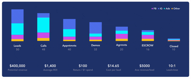
Data Tables and Dashboards
Collecting the correct data for creating visuals in a dashboard is essential because it ensures the accuracy and relevance of the displayed information, enabling informed decision-making. By selecting and structuring data effectively, you can enhance the visual storytelling and the overall effectiveness of your dashboard in conveying meaningful insights to users.
Here is an example of a data table to visualize your data.
| Category | FB | IG | Ads | Other |
|---|---|---|---|---|
| Leads | 8 | 20 | 25 | 2 |
| Calls | 10 | 20 | 8 | 12 |
| Appntmnts | 11 | 19 | 8 | 3 |
| Demos | 10 | 4 | 17 | 5 |
| Argmnts | 8 | 12 | 13 | 6 |
| ESCROW | 7 | 18 | 23 | 5 |
| Closed | 1 | 1 | 1 | 1 |